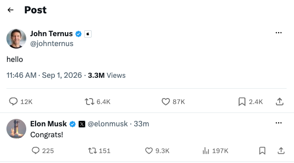
In what I’d consider his first public act as CEO of Apple, John Ternus joined and posted on X, earning an immediate congratulatory reply from transphobic antisemite Elon Musk. Cool, cool, cool.
Tech, mostly Apple, from Lex Friedman.
In what I’d consider his first public act as CEO of Apple, John Ternus joined and posted on X, earning an immediate congratulatory reply from transphobic antisemite Elon Musk. Cool, cool, cool.
Plus you’re eliminating food waste. Doing good and eating well? A dream.
I’d like to tell you about an app I love: Too Good To Go.
Too Good To Go, available and functional worldwide, helps you get discounted “surprise bags” of foods from local restaurants and supermarkets, so that those establishments don’t have to let food go to waste.
Also: You can get discounted food.
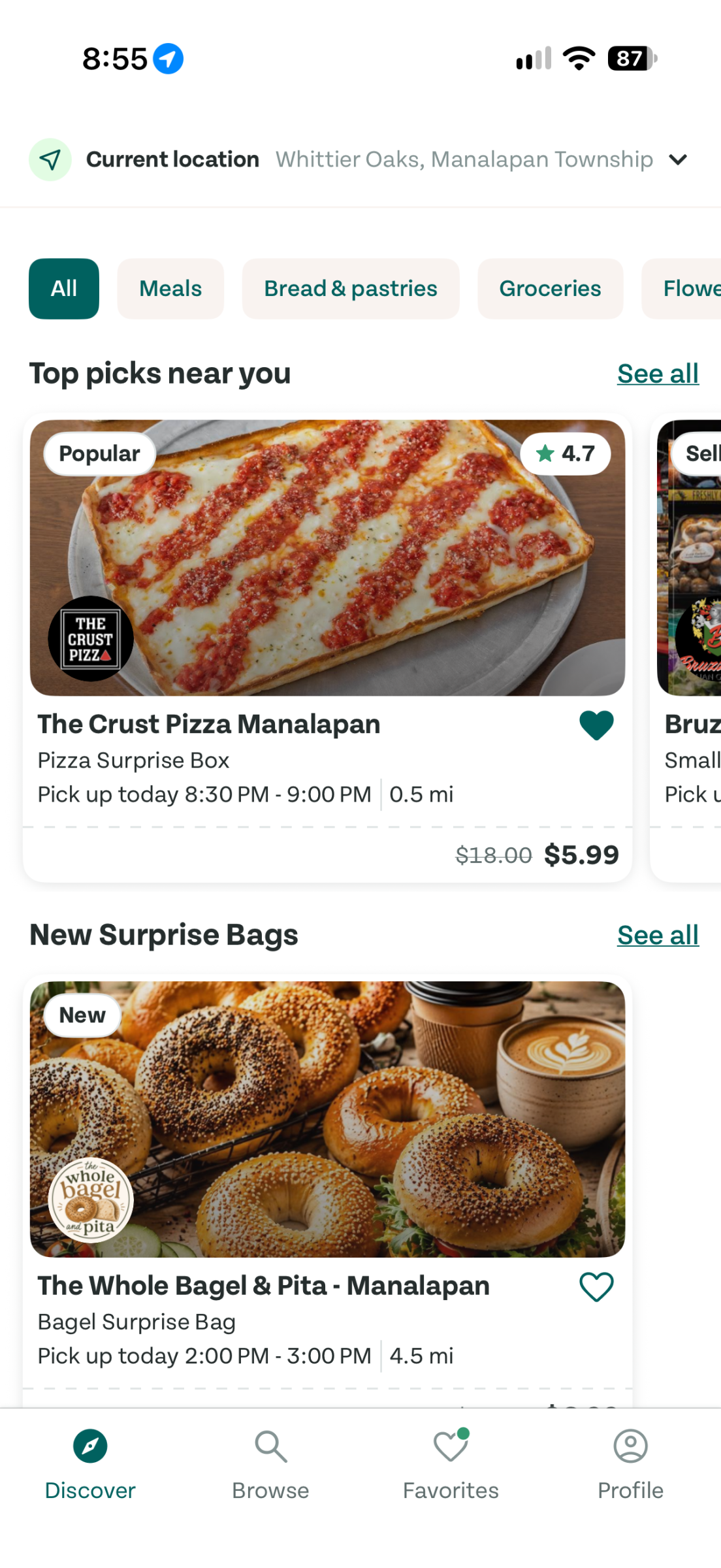
A variety of restaurants and supermarkets in my town participate with Too Good To Go. I can mark places as favorites, and I can browse the full roster of participating establishments. Which restaurants have offers can vary a bit by day. But most days, local bagel places offer an assortment of bagels for sometime after their morning rush; pizza places offer a mix of slices and sandwiches and the like after 9 or 10pm.
The catches: You prepay for your “surprise box,” you don’t pick what’s in it (or even find out until you get it), and you must arrive to pick up your box in a specific time window. These stores are looking to offload food when they can’t sell it anymore, and your job is to get it at the time they want.
The perk: You get a lot of food and don’t pay a lot for it. Plus, yeah, you’re helping to eliminate food waste. Win/win!
We grab surprise bags from a local bakery a couple times a month. If my son is starving when he comes home from a late gig, we’ll often order from one of the local pizza places on our way home so he can get a hodgepodge of food.
When we travel to other places — both in the US and internationally — we often check for local Too Good To Go boxes. It’s a fun way to discover restaurants and get a slew of good stuff to eat.
The app is free, and prices per surprise boxes vary.
TechCrunch:
The 30-year-old company remarked that it received “hundreds of thousands” of new downloads since its decision to keep the name Lake Ontario in place, and saw its app’s usage climb to 50 times above its normal levels.
MapQuest has two things going for it that I imagine are propelling it up the App Store ranks:
I am lightly annoyed with Casey Liss.
Let me be clear: I respect and admire Casey Liss. I appreciate Casey Liss. I genuinely think Casey Liss is a great dude. But I am annoyed with him nonetheless.
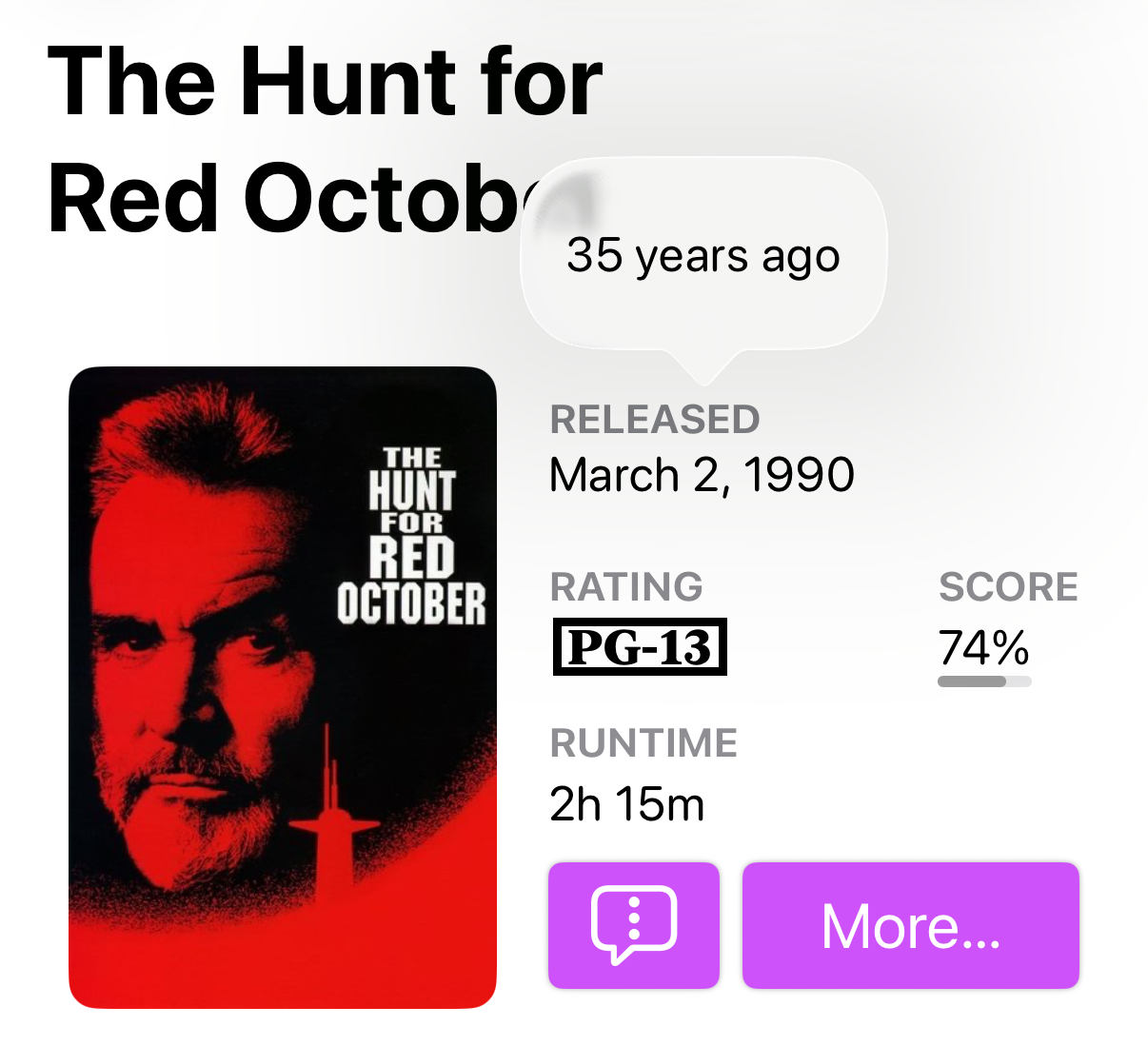
There are a few reasons for this annoyance. First and foremost: Damn, Callsheet is a great app. I wish I had built it. I wish I had had the idea to create an alternative to IMDb, and I wish I had built it with the thoughtfulness Casey used to craft his app. But I didn’t, and he did.
If you’re reading this site of mine and somehow haven’t heard of Casey’s app, that surprises me, but I’m glad to right that wrong. IMDb is bloated and overstuffed. It prompts you to leave reviews. It prompts you to use its app. It’s full of ads. It is genuinely exactly the kind of experience you’d expect when Amazon.com buys something that was once wonderful.
Callsheet is great. It has a reasonably priced subscription model, and it’s a joy to use. Check it out.
I’m also annoyed with Casey Liss because he lives far away. I’ve hung out with him several times, and every time it’s a delight. I wish I could do it more.
Casey has a couple of other apps as well. I get the sense that he’s not focusing on them as much as he used to because of Callsheet’s popularity, but if you have a use for them, they are built with a similar amount of care and ingenuity.
Peek-a-View is a read-only photo browser designed for those moments when you want to hand someone your phone without also handing them the ability to delete your photos, edit them, or start exploring parts of your photo library that weren’t included in the invitation. You can choose exactly which photos or albums someone can see.
MaskerAid lets you quickly put emoji over faces in a photo. It automatically detects the faces for you, then lets you adjust the emoji or add more wherever you’d like. That makes it useful for protecting the privacy of kids, classmates, protesters, or anyone else who didn’t necessarily agree to appear in the photo you’re posting.
I’m also annoyed with Casey because he selflessly helps me out from time to time with my own app development questions, and I’m not quite sure I’ve returned the favor yet. Hopefully this piece helps.
A shuffling of faces on Apple’s leadership page. Expected and not surprising, but still carrying its own weight when you see it plainly like this.
This is really cool. I see some more familiar faces coming up, too.
We need to talk about subscriptions. Many of your favorite apps now offer them. Some of Apple’s apps now offer them. Most of my own damn apps offer them.
We hate subscriptions. Okay, maybe you don’t, but most of us do. I know I often get annoyed at subscriptions. I think there are a few core reasons behind our distaste for paying for software with subscription fees:
There’s some truth to that last one, sort of — though some apps used to be awfully pricey, if I recall. When Aldus launched PageMaker in 1985, it cost $495. (That’s roughly $1500 in 2026 dollars.) Upgrades to PageMaker were considerably cheaper — roughly $80 to $100 every couple of years when a new version came out. (You could, of course, keep using your older version as long as it kept working.)
Adobe Photoshop cost $895 when it went on sale in 1990 (roughly $2200 or so in 2026 dollars). The standalone version cost $699 in 2012, and upgrades cost around $200 — again, if you didn’t stick with the prior version(s) for as long as you could.
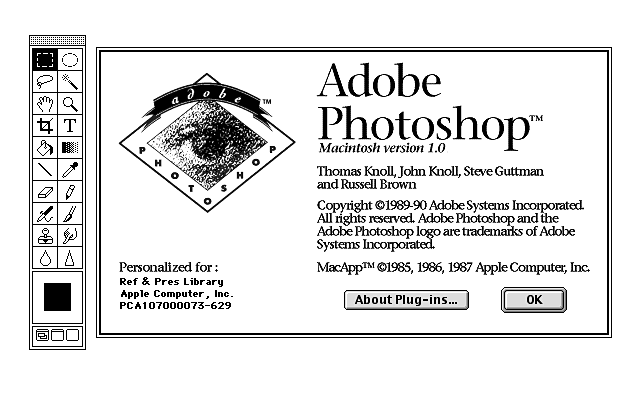
Today, you can’t buy PageMaker (because it doesn’t exist). You can’t buy Photoshop, even though it does exist, because it’s subscription only. It’s $23 per month, or slightly less if you pay for a year at a time.
This isn’t an apples-to-apples comparison, I grant you: While $699 in 2026 dollars would buy you 2.5 years of Photoshop, if you stop paying, you stop having Photoshop. That’s not how it worked when you paid for Photoshop outright.
But the upshot remains: Software is largely cheaper than it ever was, but the ownership model has fundamentally changed.
Shareware had fair fares
This holds true for games as well. Shareware games in the 1990s cost around $15. Maelstrom was $15 (and Maelstrom was a perfect game). You paid $15, and you owned it.
Shareware was generous, but it wasn’t built around the idea that all software should be free. You got to try something before you bought it; if you liked it and wanted to keep using it, fifteen or twenty bucks felt like a perfectly reasonable amount to pay an independent developer.
The App Store bears some of the blame for the pricing evolution we’re living in now. So many apps launched for free or for $1, because somehow we collectively decided that apps for devices that fit in your pocket were worth less than desktop apps. We were wrong. A $10 app suddenly looked expensive sitting beside a dozen 99¢ competitors, even though $10 would have been an absurd bargain for good software a decade earlier — and those $10 apps were far more likely to be sustainable.
That 99¢ pricing model didn’t scale. Developers want to update their apps, and sometimes they have to: An iOS change could mean their previously-functional app no longer works, or it looks funny. And there are always new features to add.
Apple bears some blame directly, too: The lack of upgrade pricing in the App Store essentially mandated this move to subscription pricing. Developers had no solid, airtight, scalable way to let previous purchasers upgrade to new features for a price. That sucks. Subscriptions solve for it, a bit grotesquely.
I do it, too
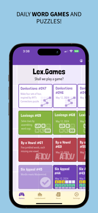
While I make Lex.Games freely available for most of the daily games, I charge a subscription for access to a few puzzles. I write nearly 3,000 puzzles a year to feed Lex.Games. That takes a lot of time. Subscribers pay me for some of that time. I’m grateful.
I released my terminal client LexShell for free, with exactly the features I needed. When folks wanted more features, I decided to make those an upsell, because… well, because they were hard to do, and required more time and testing and work.
Today, I actually launched subscriptions right here on Lex on Tech. This obviously isn’t an app. But I offered subscriptions here because I’m investing bucketloads of time into this site, and it’s nice to let folks who are willing to pay for that time do so. (Subscribers get full-text in RSS feeds, a new Lex on Tech podcast, a monthly zoom, the ability to post comments, and a few other perks. Mostly, they get to support me.)
Fee me, Seymour
My advice — to myself as much as you, dear reader — is to work on reshaping our mentalities towards subscriptions. Often, when I see a subscription available, I prefer to buy the lifetime version if one is available. If I think I’ll use an app for N years, and it works out to a savings for me to buy the app outright vs. pay the annual subscription fee for all those years, I’ll do so.
But increasingly… I don’t do so. Subscription fees offer developers guaranteed recurring revenue. (Well, usually guaranteed.) It’s hard to make a living on the App Store. If I did the math on my hourly rate for the time I’ve invested into my apps, based on my App Store earnings, well, let’s just say, I don’t do that math.
Subscription fatigue is real and it’s understandable. I’m trying, though, not to say to myself “Ugh, another subscription,” and instead say, “If I can get $5 or $10 or $20 of joy or utility out of this app per year, I am happy to pay that fee to the developer to make continued investment in the software worth their while.”
That’s a mouthful. But I do keep saying it to myself as new subscriptions crop up. I appreciate using apps ad-free; I appreciate apps that keep scoring updates and improvements. I appreciate apps that help me get more done, or that entertain me. I’m willing to pay for the privilege.
I do get sick of “the cost of a cup of coffee” analogies. I make my coffee at home. It works out to around 60¢ a cup most of the time on the high end, and often cheaper. I don’t buy overpriced coffee.
But I enjoy a nice dinner out with friends, even as restaurant prices continue to climb. If I’ve paid $50 or even $100 for my wife and me to enjoy a lovely evening with good people, that’s worth it to me, even though it “only” lasts a couple hours and then is but a memory. Framed that way, $20 a year for an app that I might spend many dozens of hours using makes a lot of sense to me.
Anyway, feel free to subscribe to Lex on Tech, which is free, but still. Subscriptions aren’t going anywhere — but the way we think about them still can change.
If we’re being honest — and why shouldn’t we? — Tim’s letter to Apple staff on his last day as CEO doesn’t really say much of anything.
The truth is, whatever there is to say about my success, I know it is all because of you. You have brought out the best in me. In all my life, I have never seen or been with such an extraordinary team of people before, and every day I get to see more examples of that.
I wouldn’t say it’s particularly well-written or insightful, though I suppose parting memos don’t have to be either. But it’s platitude-heavy and its best moment is a Steve Jobs reference:
We bring out the best in each other. We lift each other up. We have made it possible to leave our “dent in the universe,” as Steve once described it, because of who we are and what we believe, because of what we value and how we see the world.
Tim also posted a social media message saying he was “sending lots of love” to the Apple community, but he posted it on X, which ranks low on the list of “best places to indicate love” on the Internet, perhaps just after 4chan.
Indie developer Greg Pierce pointed out on Mastodon that Apple’s Assistive Access features aren’t necessarily just for the people they were designed for.
And he’s right. Assistive Access has some features you might want on your iPhone right now, even if you don’t think of yourself as someone who needs accessibility features.
You may already know about Assistive Access as something that can make an iPhone much easier for an elderly parent or grandparent to use. It’s also potentially great for a very young iPhone user whose phone use you want to limit. And, of course, Apple designed it primarily for people with certain disabilities, who can benefit enormously from a simpler, more focused iPhone interface.
But here’s the fun part: Some of Apple’s solutions to removing complications from the standard iPhone experience are great for users at any level of cognitive or physical ability, or life stage.
Assistive Access is essentially an alternate iPhone interface hiding inside iOS. You choose which apps are available, and several of Apple’s apps transform into radically simplified versions of themselves.
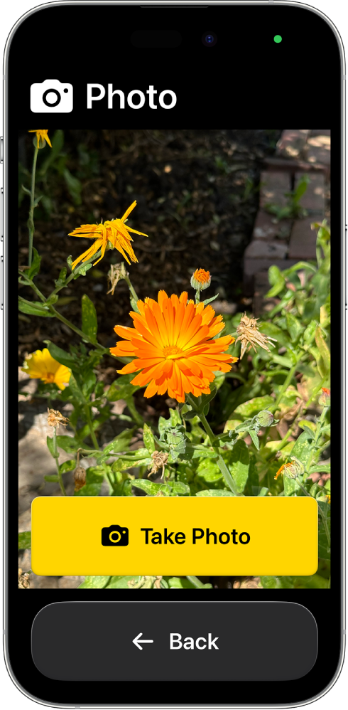
Take Camera. You can choose exactly which modes are available: Photo, Photo Selfie, Video, and Video Selfie. If you enable just one, Camera can skip all the normal choices and basically become a viewfinder with one enormous button: TAKE PHOTO.
That’s delightful if you never fuss with the other settings in the Camera app.
I know how to use the regular Camera app. I know what the buttons do. I use them! But sometimes they’re honestly annoying — they don’t respond fast enough, or I can’t swipe between them as easily as I want. Sometimes I don’t need modes and settings and options. I want to point my phone at something and take a picture. If you never need Apple’s fancier camera options, you’ll snap photos faster with their stripped-down version of the Camera app.
The Magnifier is what prompted Greg’s Mastodon post in the first place. It turns the iPhone camera into a digital magnifying glass, complete with extremely obvious controls for zooming in and out.
My eyesight is great, so I don’t need Magnifier on the regular. But I have had meals with folks struggling with menu fonts, and I’ve seen older relatives struggle to read their pill bottles.
And if you’re someone who spends half your life saying “Where did I put my readers?”, this could be a genuinely fantastic thing to know about.
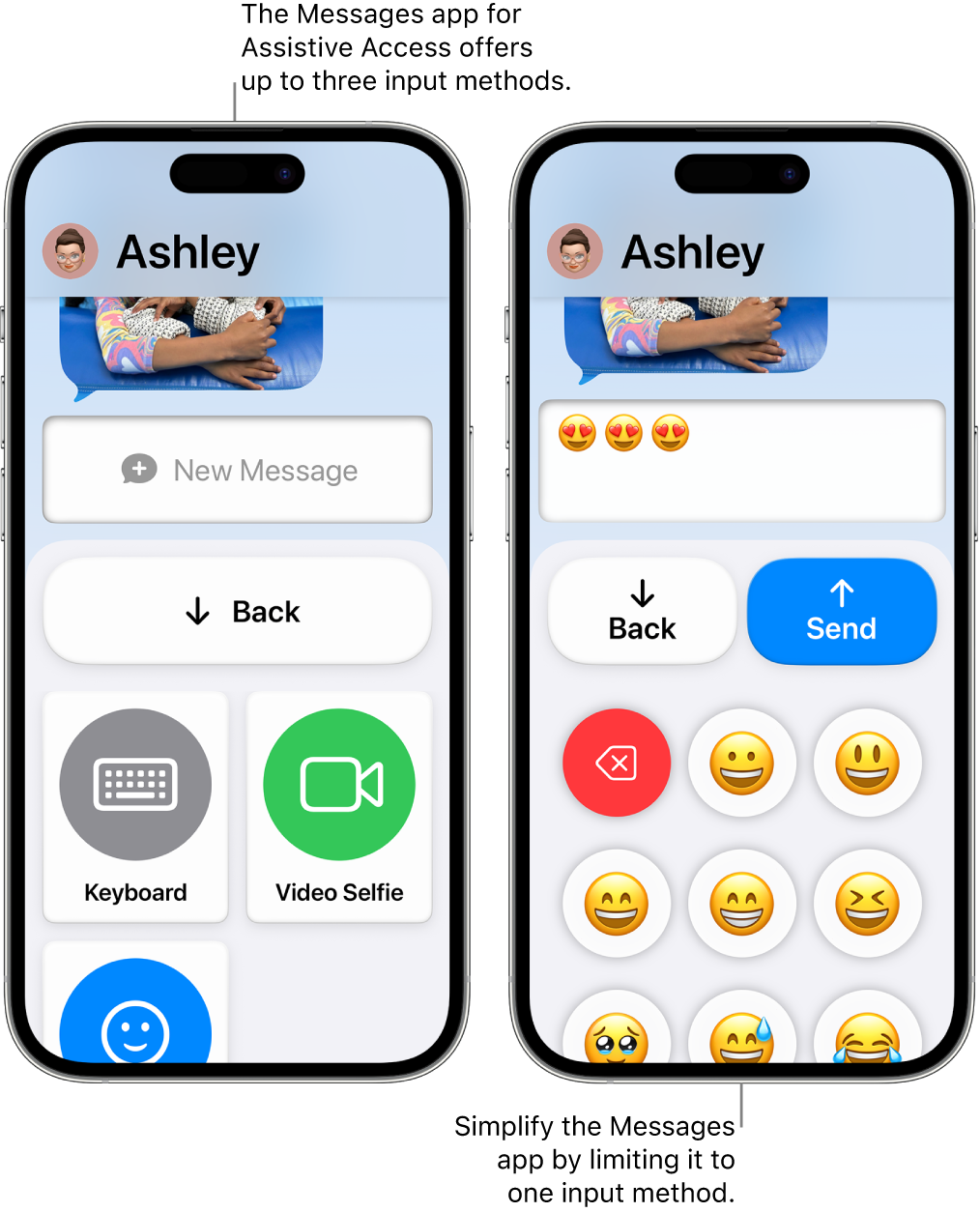
Messages with Assistive Access gets rid of a lot of cruft. You can limit the people available for messaging, make favorite contacts especially prominent, and even control the ways someone can compose a message. There’s a normal keyboard, an emoji-only keyboard, and an option to record a video selfie.
You can tap a received message to have the iPhone read it aloud.
Again, there’s an obvious accessibility benefit here. And I love the idea of hooking a young kid up with a messaging app that can just write to selected people, with a dead-simple interface.
I listen to music a lot with my iPhone, and I think that the Music app has actually gotten worse with time. I want to switch to the Assistive Access version of the Music app full-time, but it’s not quite enough for me — it can only play music you’ve pre-identified, not search the infiniteness of Apple Music’s streaming offerings.
But it’s surprisingly close. This version of the Music app basically says: Here are your songs. Pick one. That’s it.
Photos gets stripped down, too. You can have a big, simple photo grid and limit what’s available to photos taken on that iPhone and specific Shared Albums.
For an elderly relative, that’s potentially wonderful. Imagine Photos basically being “your pictures, plus the family album.” But I can imagine uses beyond that, too — particularly for an iPhone you’re repurposing for a specific job, lending to someone, or setting up for a kid.
And Calls combines Phone and FaceTime into one simplified app. Favorite people can be displayed prominently with their photos, and you can control who can make or receive calls.
There’s a pattern to all of these.
Apple built Assistive Access because sometimes the enemy of good is better: All the improvements each new iteration of iOS provides also make apps more complicated. We know many of us hate change, especially when it feels like an app’s interface is updated just for the sake of looking different. There’s some real consistency to how the Assistive Access versions of these apps look, even across iOS release updates.
Obviously, Apple can’t just use these more accessible interfaces across the board for all users; we demand more features, and powerful fiddly options, and complexities matter when your needs are, well, complex.
But the clever approach to simplified UIs that these variants offer is a solid reminder that sometimes simplicity is a win. If that quote about if I had more time, I’d have written a shorter letter (attributed to many, many people) resonates with you at all, I think there’s something to the idea that if developers had more time, they’d have simpler interfaces.
Every one of these simplified versions of Apple apps has at least some design decisions that are upgrades to the standard versions of these apps, even if these versions aren’t workable for full-time use. There’s something worth learning from the versions of these apps where Apple intentionally took some things away.
One of the reasons I launched Lex On Tech was to highlight independent developers more often. Today the spotlight goes to Europe, and to Ben Rice McCarthy, who has been designing and shipping iPhone apps for more than a decade. I’m a big fan of Ben the human, the designer, and the app developer.
Many indie developers are engineers who picked up enough design sense to ship something that looks good enough. Ben went the other direction: They studied graphic design in college, then taught themselves to code — Objective-C first, Swift later — so they could build the things they had already designed. You can tell which one came first. Ben’s apps don’t read as feature lists with a coat of paint on top. Each one starts with a thoughtful interface, focused on smart interactions and careful design.
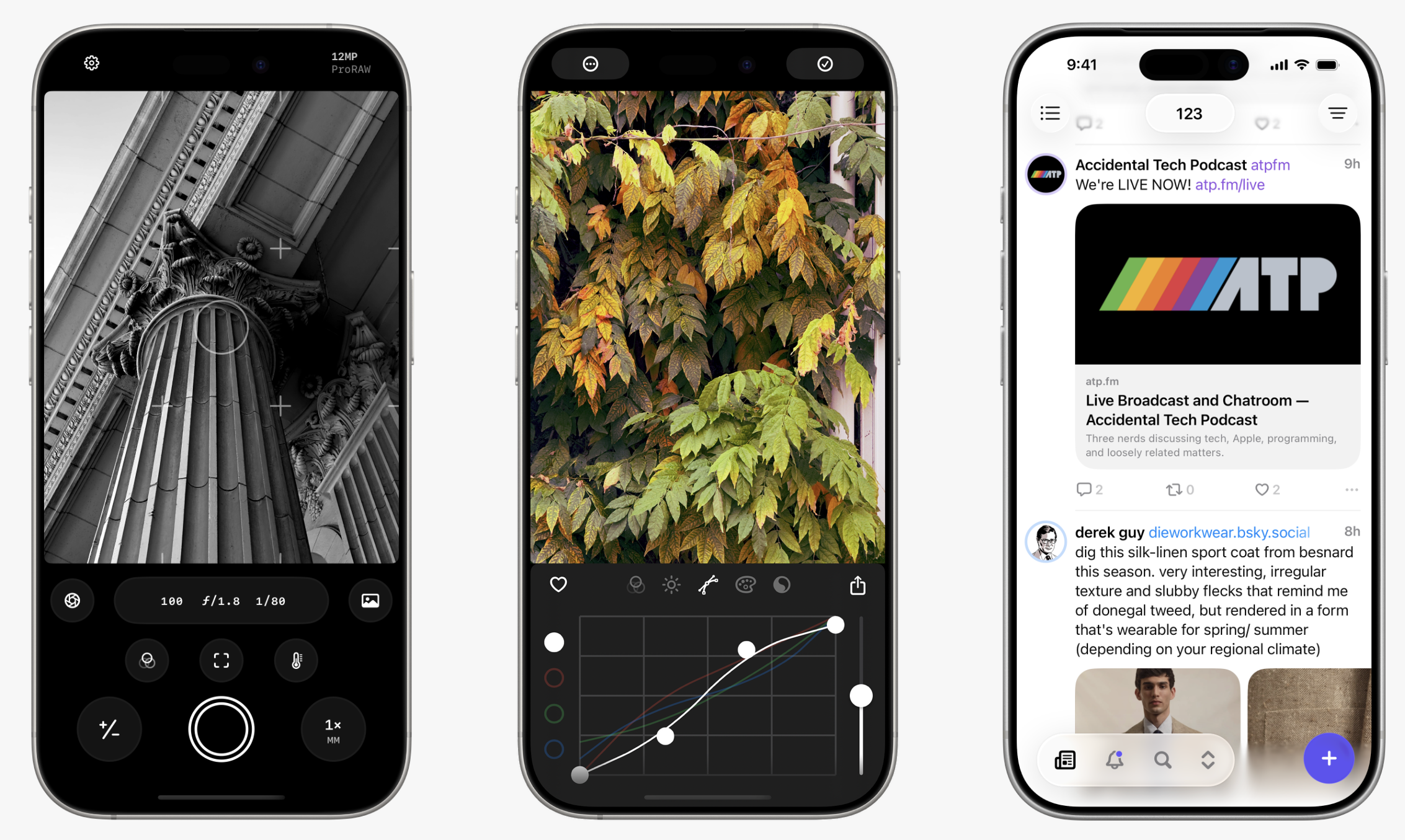
Obscura is the flagship, and Ben has been working on it since 2014. Obscura 2 was an Apple Editors’ Choice in 2018, ran on the demo iPhones in Apple Stores around the world, and turned up on slides at WWDC. The tagline — “built for pros, designed for everyone” — is spot on.
Everything is reachable one-handed. Radial dials swing out from a button when you tap and drag. Manual focus comes with peaking and a loupe. There are haptics, so you can feel a stop of exposure go by without looking. And when you change a setting, the value flashes across the viewfinder in enormous type, so you keep your eyes on your subject instead of on the app.
Obscura spent much of its life as a paid app that you re-bought at each major version. With Obscura 4, it went free to download, with an Obscura Ultra subscription — $3.99 a month, $24.99 a year, or $64.99 once — unlocking everything.
Obscura Studio is the photo editor, and it’s the same deal — free to play with every filter and tool, with saving and exporting behind Obscura Ultra or a cheaper Studio+ tier at $1.99 a month or $11.99 a year.
The restraint here is the whole point. After ten years on the capture half of photography, Ben built the develop half as a separate app instead of bolting six more panels onto Obscura. Two jobs, two apps, neither one bloated.
Two of Ben’s apps are collaborations with Canadian developer Aaron Vegh, and they’re the clearest illustration of the friction-removal instinct.
Croissant arrived in 2024 and does one thing: You write a post once, and it goes to Bluesky, Mastodon, and Threads. It handles threads, images, alt text, and Mastodon content warnings, and it costs $2.99 a month, $19.99 a year, or $59.99 once. Ben and Aaron built it after getting fed up copying the same post — and the same alt text — between three apps. The alt text is the tell. Someone who bothered to solve the alt text problem is thinking about readers, not just about posters.
Indigo is the bigger swing, out this past May for iPhone, iPad, and Mac. It’s one timeline holding both Bluesky and Mastodon, synced across your devices, with a composer that posts to both at once. Reading is free; the rest is $4.99 a month, $34.99 a year, or $119.99 for good.
The rest
The remaining four apps are where the design muscle stays loose. Ketchup for Poké is a free Pokédex and catch tracker, with the original 151 included and everyone since behind a Ketchup+ purchase. Aether is a $1.99 Pokémon type calculator built around three dials, with no tracking, no upsell, and no subscription — you buy it and you own it. Freckle makes polka-dot wallpapers. Agile 3 is a game about tapping dots quickly.
Points, as ever, for naming. Ketchup, for an app about catching them all, is very good.
Ben also consults for other indie developers these days, lending the design eye out to other people’s apps. (Including helping me out with mine!).
Check out Ben’s apps.
You’d be hard-pressed to find corners of the Apple nerd community where John Siracusa’s name isn’t known. He wrote those mammoth OS X reviews for Ars Technica for many years — some of which you may still be reading now. (They were long.) He cohosts Accidental Tech Podcast and Robot or Not, and authors Hypercritical.
And he also makes Mac apps. And John’s approach to Mac apps has a unifying quality: He wants apps that make his Macs behave the way he wants them to. And he offers them to the rest of us, in case some of us see the same peccadilloes that John sees. The apps are straightforward, intentionally fussy (in terms of how configurable they are), and do precisely what they set out to do.
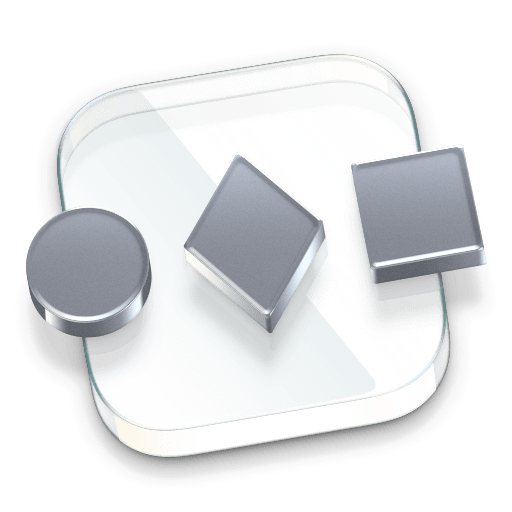
Front and Center is a $5 Mac App Store app that gives more control over how window layering works. In classic versions of Mac OS, clicking on an application’s window brought all of that app’s windows to the front. On modern macOS, clicking a window brings just that window forward; other windows from the same application stay just where they are.
With Front and Center, you can both choose which behavior you’d prefer to have as the default, and use Shift-click on a window to trigger the opposite behavior.
SwitchGlass is an $8 Mac App Store app for creating a customizable app switcher. In pure Siracusa fashion, it’s exquisitely customizable: You control the look and feel of your app switcher; you decide which display(s) it may appear on; and you set its visibility, position, and orientation. SwitchGlass even lets you get as fiddly as adjusting its rounded corners, or determining whether it shows all apps or only apps with active windows on the current display.
Finally, Hyperspace helps you reclaim storage space on your Mac when your drive contains duplicate files. If you have the same file stored in more than one place, Hyperspace figures it out, treats one copy as the canonical version, and uses space-saving clones to save space.
What I love about John’s apps is that they all clearly were born out of needs he felt personally. Apps built directly from the developer’s own needs and passions are opinionated and definitive, which are great qualities for powerful utilities.
I assume you give this post five stars.
Apple offers iOS app developers a mechanism to ask users to rate and review their apps — within the apps themselves. It’s called StoreKit’s requestReview API. The developer essentially asks iOS to show the rating/review prompt at a given moment, and the system decides whether to display it or not. Apple limits how often the prompt can appear and may suppress it for other reasons, so developers can’t assume that calling the API will result in a prompt being shown.
Users hate these prompts. John Gruber hates these prompts. Though Gruber’s distaste is nuanced. In his followup to that aforelinked post, John wrote:
[T]o be competitive, apps need to do the wrong thing. I’m a competitive bastard. If I had an app in the App Store today, I’d probably prompt for reviews. I don’t begrudge developers who do it today. That’s the game. I admire developers who refuse to play this part of the game. It’s noble. But it’s not a winning strategy. I want Apple to fix the game — that’s the only real solution.
At this writing, I have six apps in the iOS App Store. My first app, Lex.Games, has 306 ratings and a 4.9 star average. (This is not a humblebrag. It’s just a fact. And a regular brag.)
My other app ratings break down like this:
LexShell (which, admittedly, is less than a month old): 5 stars, 2 ratings
Gimme a Second: 5 stars, 2 ratings
Gnome: 4.7 stars, 9 ratings
Tile & Error: 4.7 stars, 15 ratings
Cryptograms by Lex.Games: 5 stars, 6 ratings
I didn’t normalize for app installs. I don’t think it would change the fundamental point I’m making here which is: Just two of my apps break double-digits in ratings quantity, and they’re the only two that prompt users to rate.
I gave a lot of thought on when to prompt. In Lex.Games, the prompt only shows up after you solved five puzzles. That tells me you use the app a decent amount, and ideally you’re in a good mood because you just solved a puzzle.
But I’m lying. Lex.Games used to do that. I started getting a lot of ratings of either 1-star or 4-stars, saying they loved the app but hated that it asked for reviews. I can do math. I had enough great star ratings that it didn’t feel like there was any upside to continuing to ask for more reviews. So I stopped.
But like John wrote: This situation sucks, and it’s Apple’s to fix.
Plentiful reviews are a great sign that an app is good. I have no qualms about installing an app that has four or more stars, and I’m especially reassured when it has a couple hundred reviews.
It’s borderline impossible for a developer to get that number of reviews without begging users for them.
I don’t know what the ideal solution is. Amazon’s reviews are often gamed, and Amazon gets plenty of things wrong, but they do one thing quite well: They note when an item is frequently kept or frequently returned. Maybe a line like Most users keep this app installed or Often in the top-ten most-used apps on user devices or Most users launch the app 4-5 days per week or something could help. (This would obviously have to be aggregated and anonymized and opt-in. We love privacy.)
Uber drivers, eBay sellers, and App Store developers can be ruined by bad average ratings. In some ways, that’s good; we want to be warned about bad actors, and we love reassurance about good ones. But if we can’t build good reputations without annoying our customers, that’s a pretty serious problem.