Greg de J makes apps that leave things out with intention.
I wrestled with that sentence, but I think it’s right. Apps tend to get more complicated over time, because adding features is easy and removing is scary, and tends to alienate at least some users, since every feature has a fan.
Greg’s apps — Quiche Browser and Quiche Reader, both from his one-person shop Quiche Industries — go the other direction. They’re minimalist, but not lacking in features. They’re minimalist in that Greg thought hard about what users actually need, and then put those features exactly where you’d look for them.
Greg is French, lives in Tokyo, and spent five years as a web and UX engineer at Google before leaving what he calls “a comfy job” to build products that line up with his values. (He later did stints at Appier, Beam, and iA, the folks behind iA Writer.) His personal site lists four principles: simplicity over complexity, obsess over the details, respect platform conventions, and encourage mindful digital consumption. Many developers don’t even spend time thinking about these sorts of design principles. Greg does, and his apps embody them.
Quiche Browser
Quiche Browser launched in July 2023. Greg says it’s been downloaded more than 75,000 times, it carries a 4.9-star rating in the App Store, and it got Fireballed this past March, when John Gruber called it “a very robust, exquisitely designed, stunningly handsome web browser.” John said that after running Quiche Browser as his default, deciding whether to go back to Safari was “a remarkably close call.”
You may know that Apple’s policies (at least in the US) require that browsers use Apple’s WebKit engine under the hood. Quiche is no exception. What Greg built from scratch is everything around the web page. That’s the part you interact with.
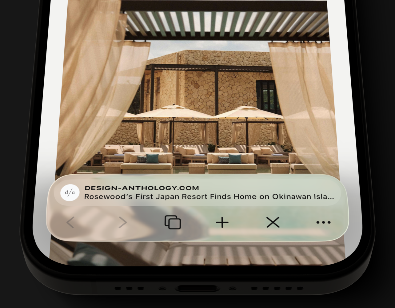
The pitch is customization, but a very particular kind. You choose which buttons live in the toolbar and where they go. The stuff you use less often goes in a popover menu, which you can also arrange. The address bar can show the domain, the page title, the site’s favicon, an estimated read time — or you can switch it off entirely and browse with nothing but the page and a couple of buttons. If you’d rather not fiddle, there’s a list of ready-made toolbars to start from.
The risk is that an app of this sort feels like settings overload. Quiche doesn’t. The Verge called it “somehow both incredibly simple and one of the most customizable browsers I’ve ever tried.”
Then there are the little things, which in this app aren’t little at all:
- Ads, trackers, and cookie banners are blocked out of the box.
- A one-tap JS button in the toolbar turns JavaScript off for whatever site you’re looking at.
- You can use any search engine you want, including Kagi, and turn off the AI features on Google, DuckDuckGo, Bing, and Brave results.
- Tabs can be a list or a grid, sorted by how recently you opened them, by read time, or grouped by site.
- The toolbar comes in Liquid Glass or Classic, in case you’ve had enough Liquid Glass for one lifetime.
Privacy-wise: no sign-up, no telemetry, no analytics, and the app never talks to any server (outside of the sites you’re browsing) except RevenueCat, to handle purchases.
Quiche Browser is free. Quiche PLUS, at $3.99 a month or $29.99 a year, unlocks website darkening (a proper dark mode for every site), Comfort Mode (which pulls tabs, favorites, and search suggestions down to where your thumb already is), and the extra app icons and button styles. Greg is upfront that building a browser alone is a full-time job and that PLUS is what pays for it. There’s no investor, no search engine deal, and no data monetization in the mix. The iPad version is in beta, and a Mac version is on the wish list — his and mine.
Quiche Reader
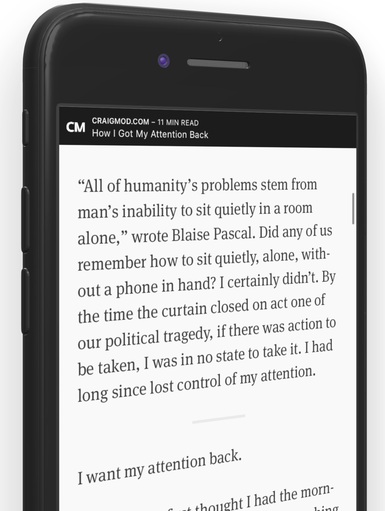
Quiche Reader solves the problem that every read-it-later app eventually creates: the painfully long list that leaves you feeling like you’ve let yourself down. And maybe the writers whose articles you’ve deferred, too.
You know the list. You’ve been saving articles to it since 2018. It has 900 items in it. You open it, scroll for a bit, feel bad, and go look at Instagram instead. It’s not unlike flicking through a bunch of Netflix shows and then turning off the TV.
Quiche Reader doesn’t show you the list. It shows you one article. The oldest one, in fact, on the theory that the newest thing you saved isn’t necessarily the best thing you saved; it’s just the most recent. You read it, archive it, or delete it, and only then do you get the next one. You can snooze an article to push it to the back of the queue, but only three times, after which the app would like you to make a decision, please. It also nudges you to let go of anything you haven’t read in 30 days.
It’s not exactly a read-it-later app. It’s a read-it-later-or-don’t app. Choices must be made.
Saving works from any app on iPhone, iPad, and Mac, and there are extensions for Safari, Firefox, and Chrome. Swipe to archive and the next article appears instantly. Everything lives in your own iCloud storage. There’s no account, there’s no tracking, and it’s free, with no in-app purchases at all.
The common thread
What I love about Greg’s apps is that they’re opinionated without being challenging. They exude tremendous polish and thoughtfulness. Quiche Browser gives you a hundred choices about your toolbar because the toolbar is the thing you touch constantly. Quiche Reader gives you almost no choices at all because choosing was the whole problem. It’s the same philosophy, executed in opposite ways.
Neither app leaves you feeling like something’s missing. They leave you feeling like somebody thought about it.
Check out Greg’s apps.